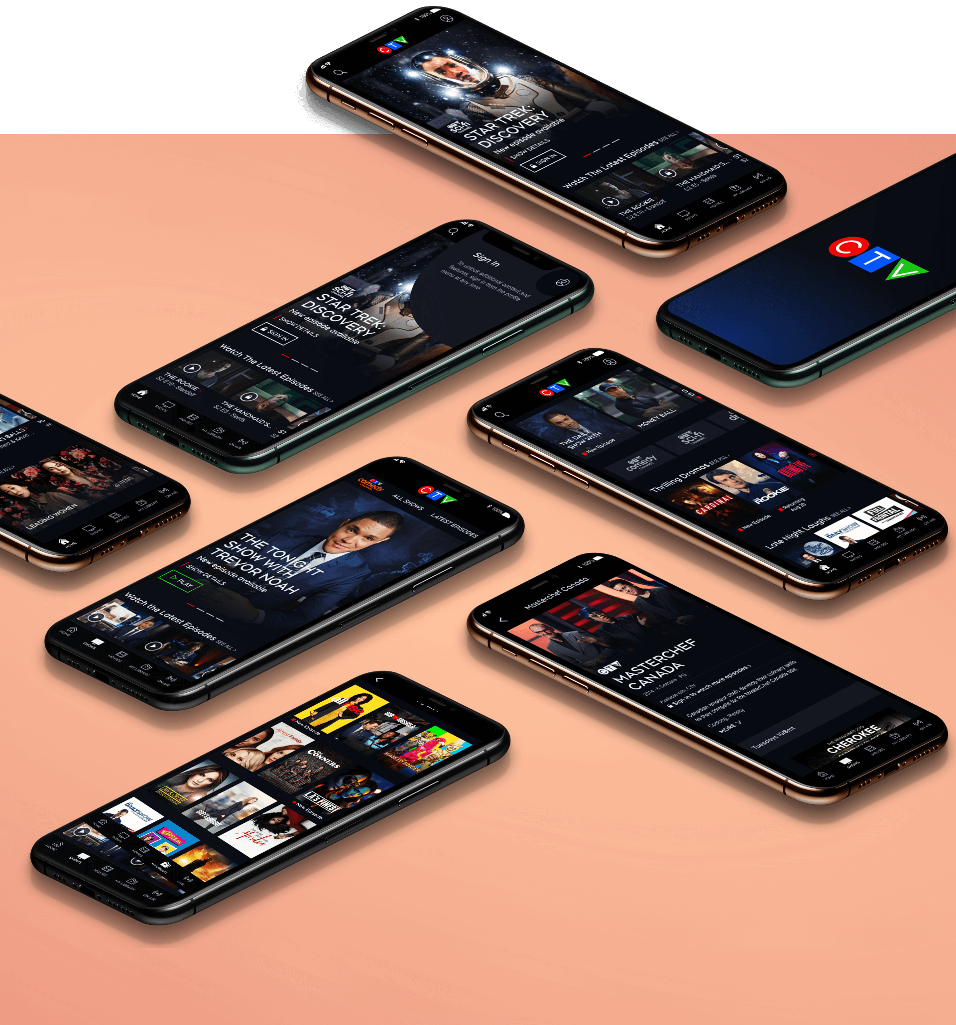
CTV
Introduction
CTV, Canada's primetime network of 22 years offered a robust slate of hit new series and classic content. Equivalent to it's US counterpart such as CBS, CTV aims to provide unparalleled news, entertainment, events content that creates a connection, inspire, and captivate audiences across the provinces. CTV offers a range of network in one basket over the years and wished to expand its digital presence for the online environment in steaming entertainment.
W3 Silver for Television Website
The Problem
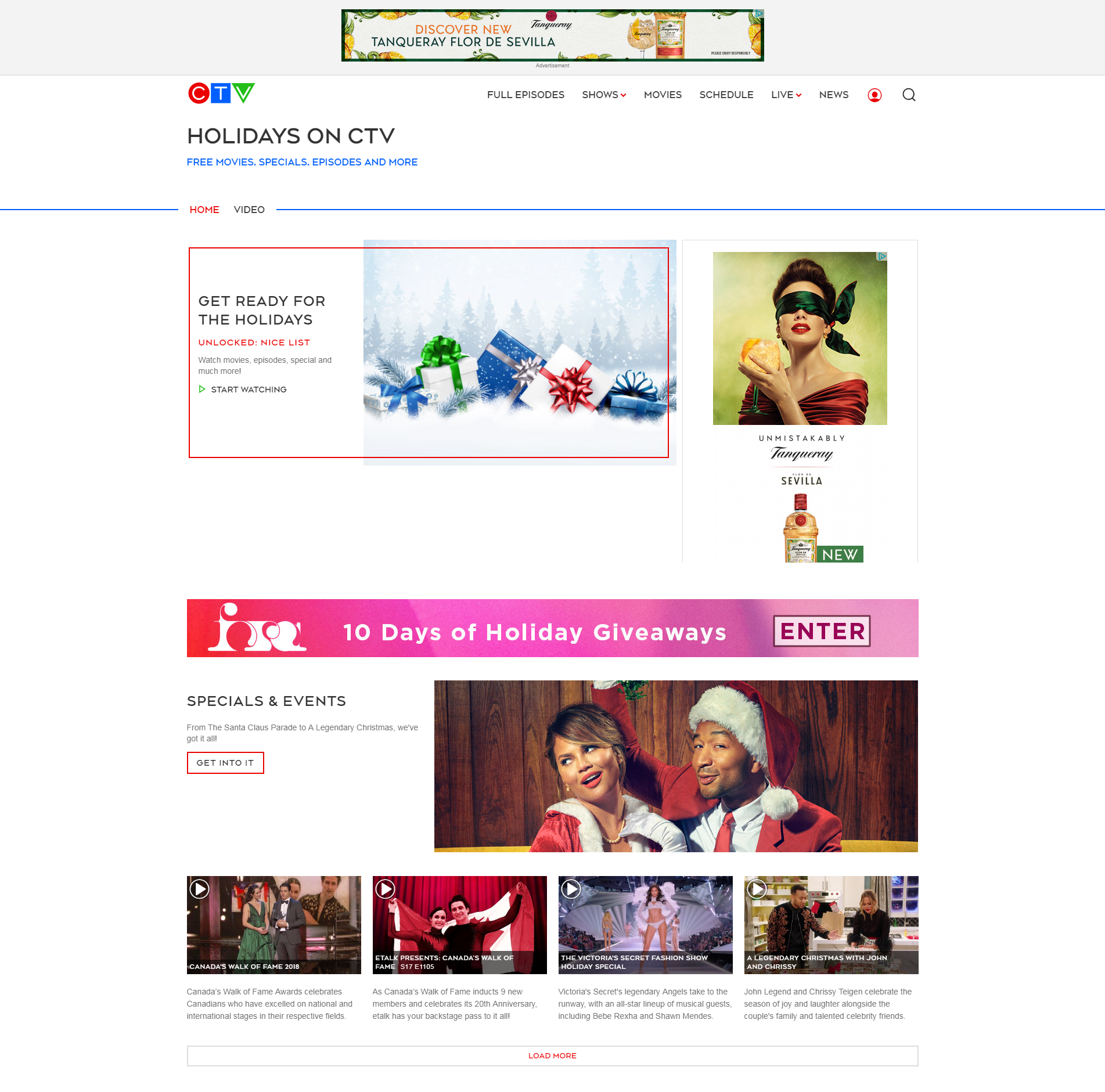
At the time, CTV still operated under the assumption that web and streaming comes secondary to cable TV where the majority of the business operated for the last several decades. The leadership saw its website as a place for supplementary content like articles, contests, and event schedules.
However times are changing and it was time for CTV to make a new paradigm shift. With years of operating without a need for user input, CTV has lost what people loved the most. Video. So how do we introduce users back into CTV and close the loop?
My Role & Goals
UI Lead
Lead UI product vision
Holistic Design
Marry UX research with UI deliverable
12 mo.
Nov 2020 - Apr 2022
13%
Increase online traffic
Being Truly User Centric
To understand CTV's users, I collaborated with the UX team to conduct a series of surveys and moderated user studies to shine a light on our users' needs. One of the surveys conducted included 64% female and 26% male. It was live for 5 days and received a total of 3026 responses. From the research, we hoped to gain insights on questions such as:
- Who are our users?
- What motivates our users to watch?
- How much content do users watch on CTV?
Who are are users?
12%
Age 18-26
25%
Age 51-60
21%
Age 27-40
18%
Age 61-70
20%
Age 41-50
4%
Age 70+
What do our users want?






Why do users visit?
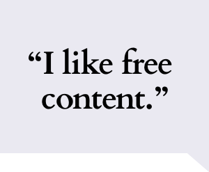
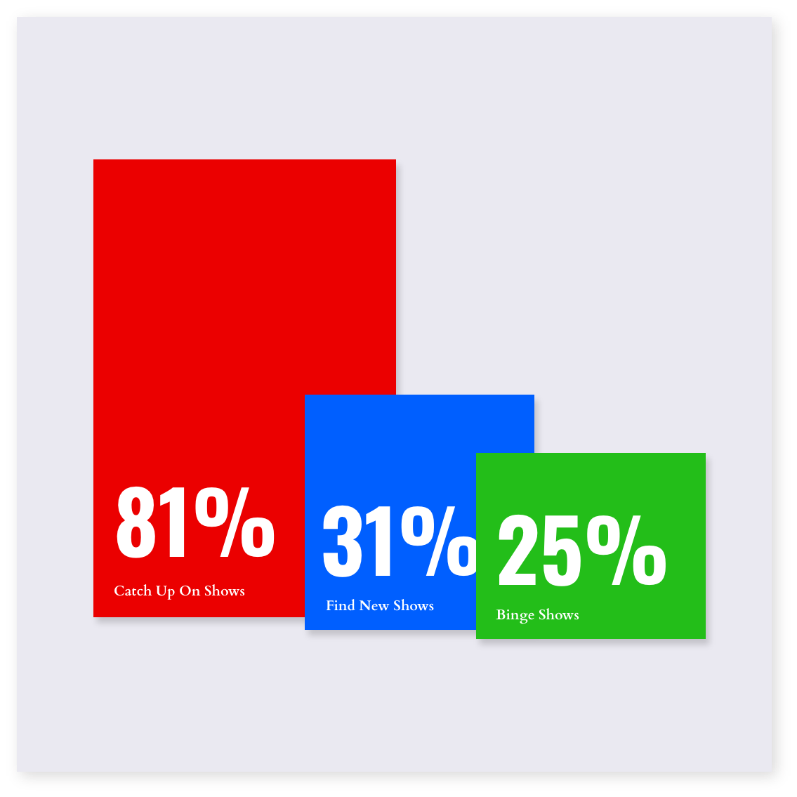
Desire for New Content
CTV users primarily seek new shows in the zeitgeist of pop culture. Users watch content to accompany tasks such as arts and crafts, work, or eating. Users want to catch up on their latest shows to concentrate on the content.
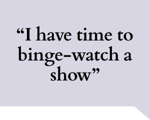
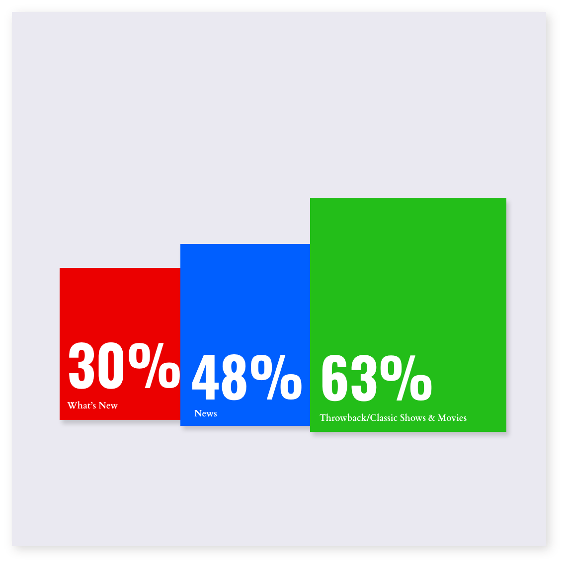
Binge-watching Comfort Shows
While new shows can be tempting on a weekly schedule, Throwback or Classic content that is free to the users is a popular choice for binge-watchers. Users either know their favorite shows or are recommended by word of mouth through friends and family.
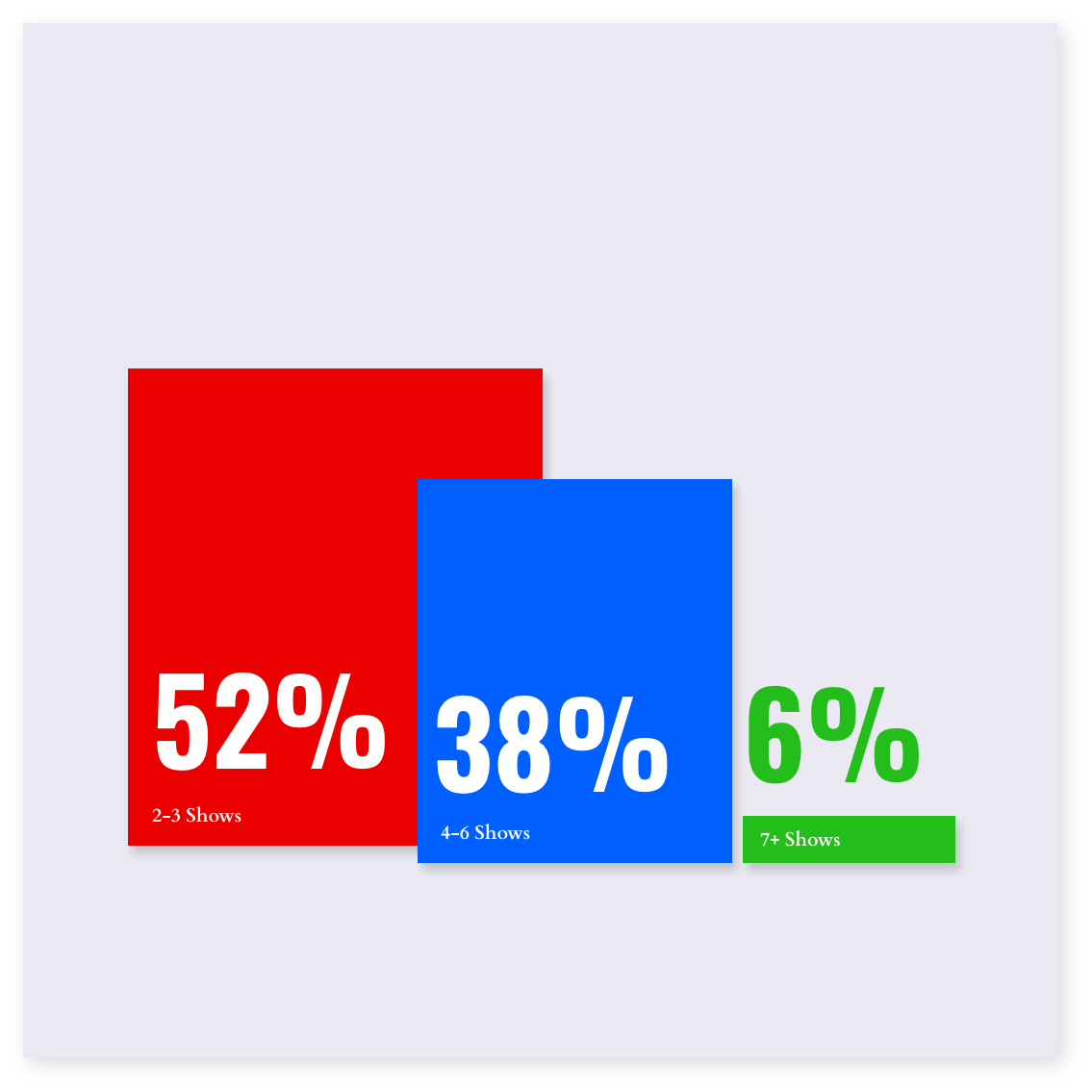
Power Gratification
Our research also indicated periodic bursts of show-binging behavior where watchers viewed anywhere between 2-6 shows in one sitting ranging from 1-6h of continuous content.
Key Takeaways
- Video plays a major role in CTV and people come to site seeking to explore such content.
- Watching Live TV and finding schedules play a higher role in contrast to reading articles or entering contests.
- Schedules are most valuable to Live TV users.
- People under 50 years of age visit for the free video content.
Designing for Ease of Use & Inclusivity
UI/UX team collaborated to build the foundations of a core persona based on patterns of behavior collected from the survey. We hypothesized that users want easy-to-digest pieces of video content that serve to give a quick view of the latest shows and as well as surface a vast collection of backlog content.
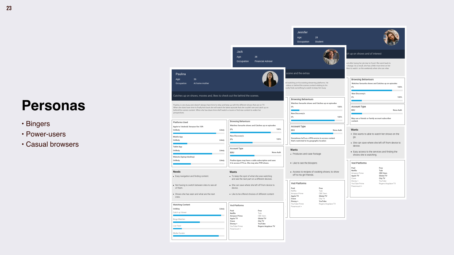
The UI team ideated solutions that placed video content front and center. We focused on creating easily glanceable titles, short show descriptions, and SEO-friendly pages that can direct traffic to the site quickly and efficiently.
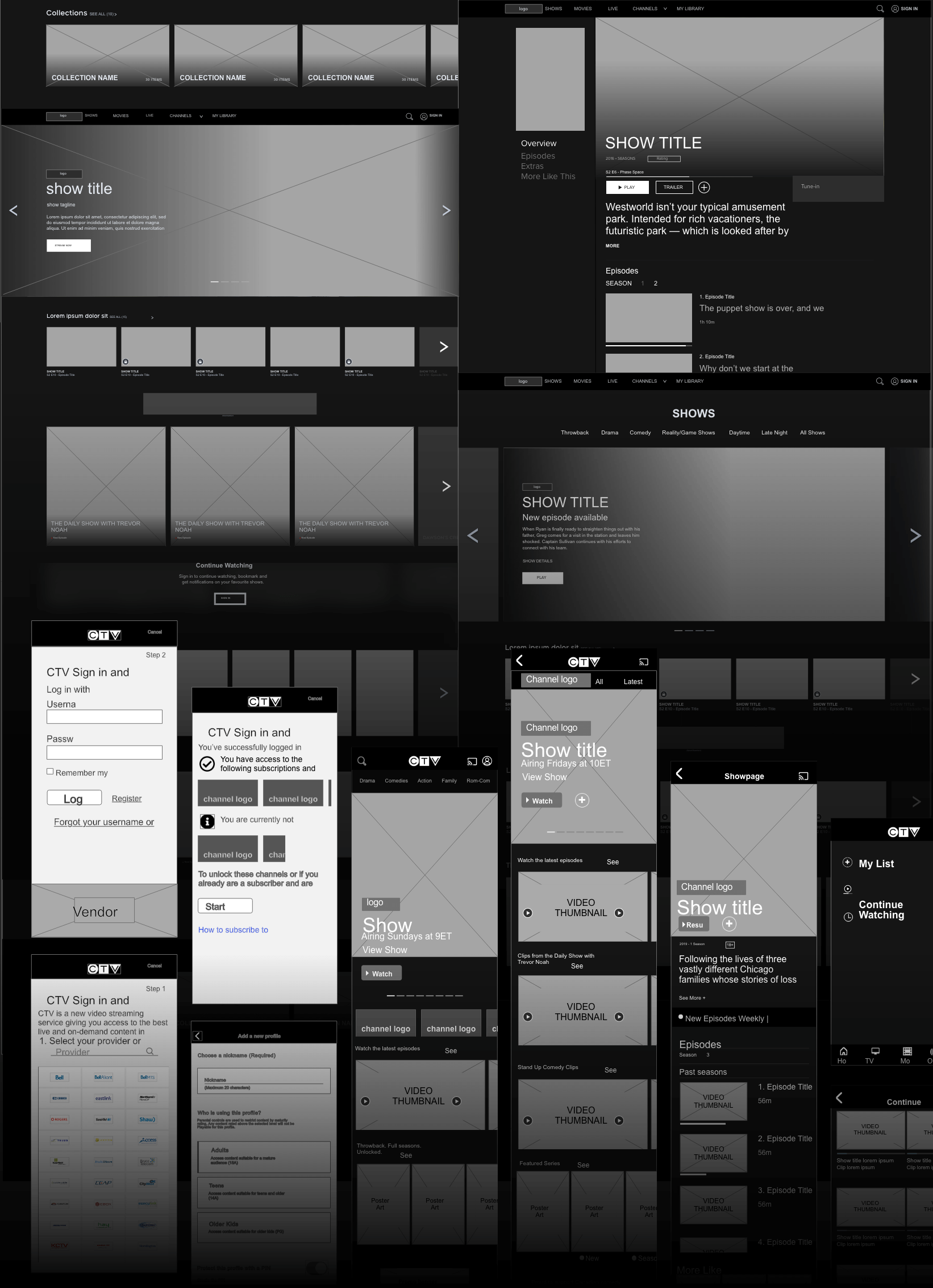
We forgo solutions such as light boxes or layovers in favor of in-page layout for SEO-friendly, accessible solutions. This significantly impacted our accessibility score from Qualtrics from 54% to 86% on average.
Thinking About Comfort: Light vs Dark Mode
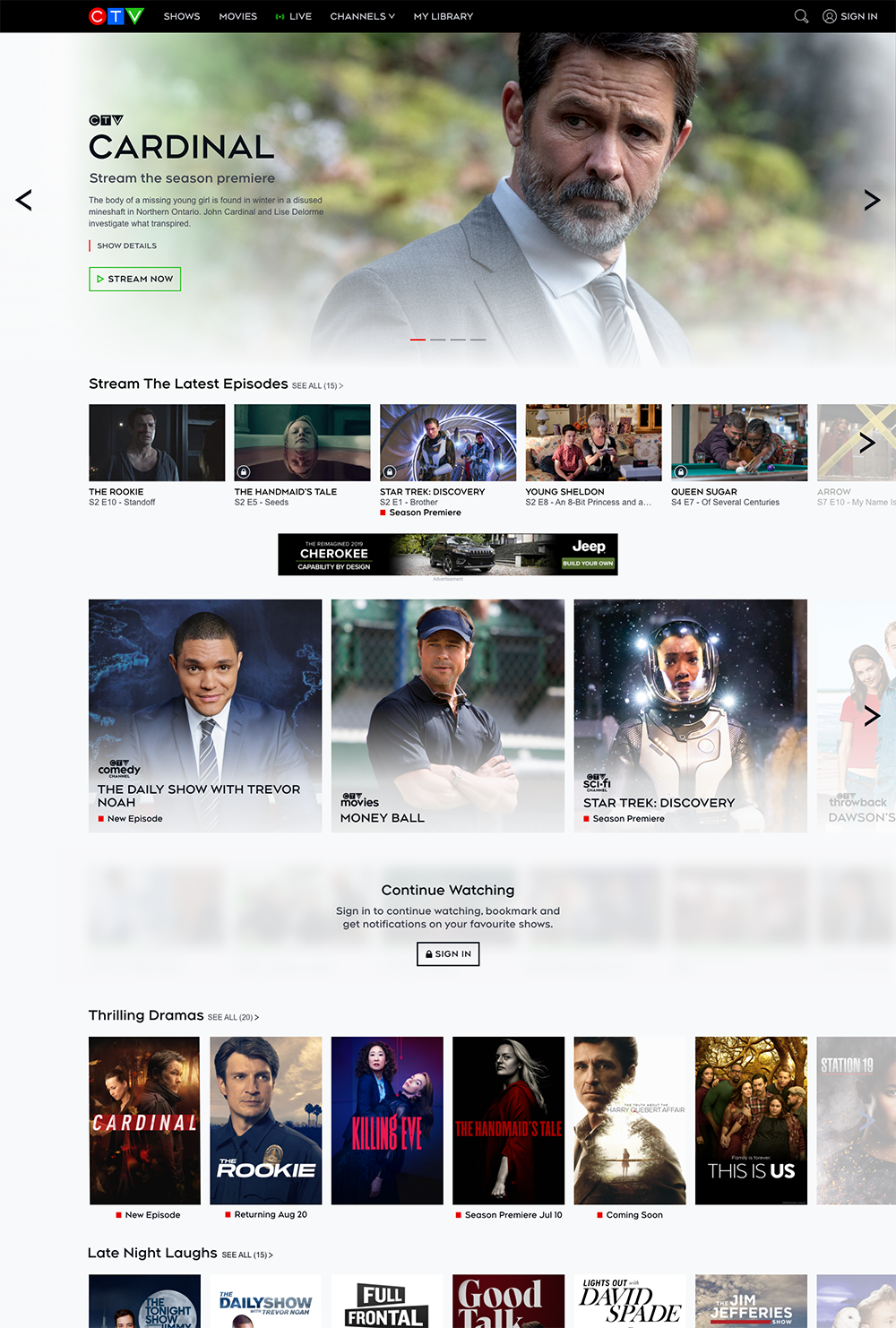
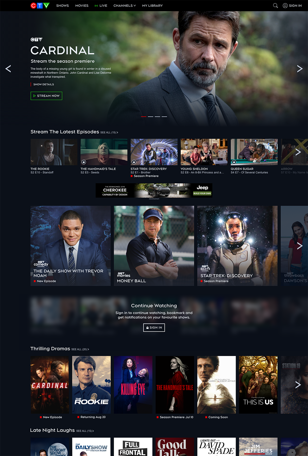
In an example of design-phase usability testing, we wanted to find out what environment best suited users while binging. 95% of users preferred a dark "theatre mode" as they browsed or watched. This gave the leadership team new insight that adhering to a strict brand standard (previous CTV environment was primarily light for reading purposes) could disrupt viewership on a subsconscious level.
Reduce Cognitive Load
From a business standpoint, putting more shows in front of a viewer sounds more business savvy because of a higher chance of content visibility. However, from the surveys, 85% of the users reflected that too much content can cause a sense of "being overwhelmed." So how should we strike a fine balance between the two?
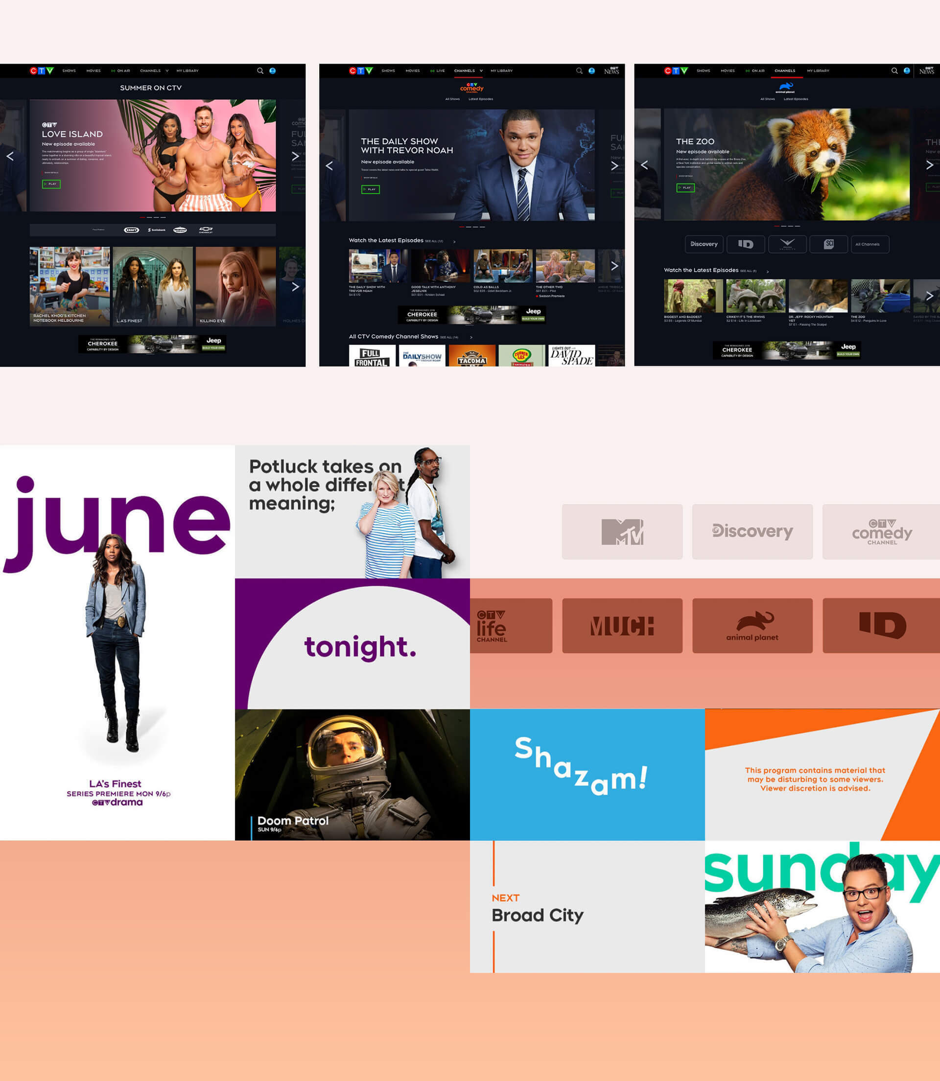
The UI team whent through various iterations and came to a hierarchy that can best meet both group needs.
We used:
- LG carousel rotators to highlight fresh new shows
- 1x1 Cards for secondary promotions
- Chiclets for channel visibility
- Poster blocks for individual show content
Conclusion
Overall with a clearer view of user desires to watch instead of read, the teams were able to improve the overall CTV experience by creating a video-focused platform. We improved the usability score by 23% on average and the SUS score by 20%. The traffic since MVP launch on web & apps reached over 15 million Canadians on an weekly average. CTV lead outcompetted competitors by 40% during primetime TV on the AVOD platform becoming Canada's #1 video streaming service.
