Crave
Introduction
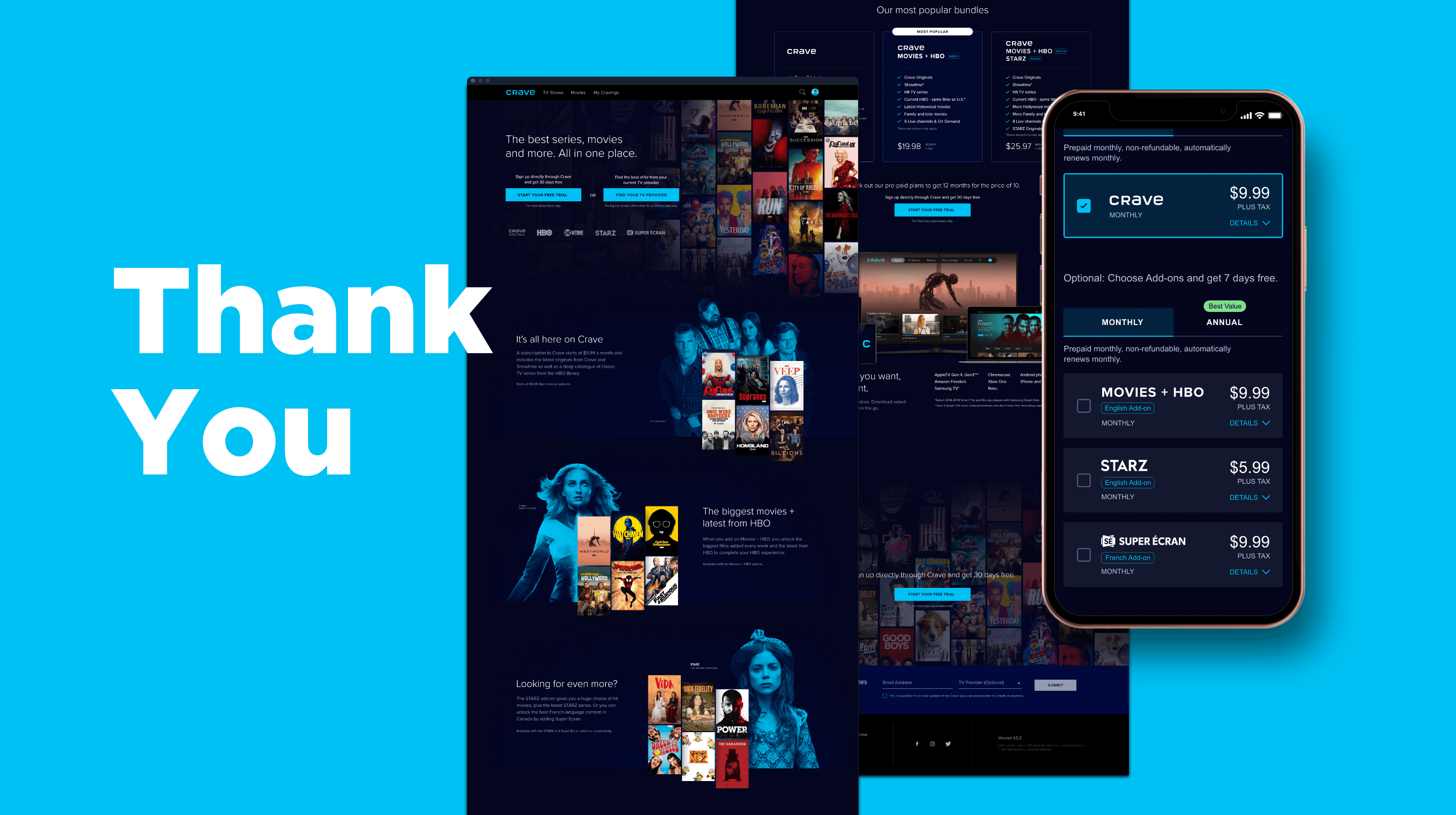
Crave is Canada's premium entertainment platform home to Oscar-nominated, Emmy Award-winning programing including HBO, HBO Max Originals, SHOWTIME®, STARZ, hollywood hit movies. It is a bilingual streaming service with French and English content available on IOS, Android, TVOs and more. Since the inception of the product in 2014, the product needed a major revamp to change the brand perception.
W3 Gold for Streaming Media on-Demand, Web aesthetics
W3 Silver for Streaming Media on-Demand, Website-Television
The Problem
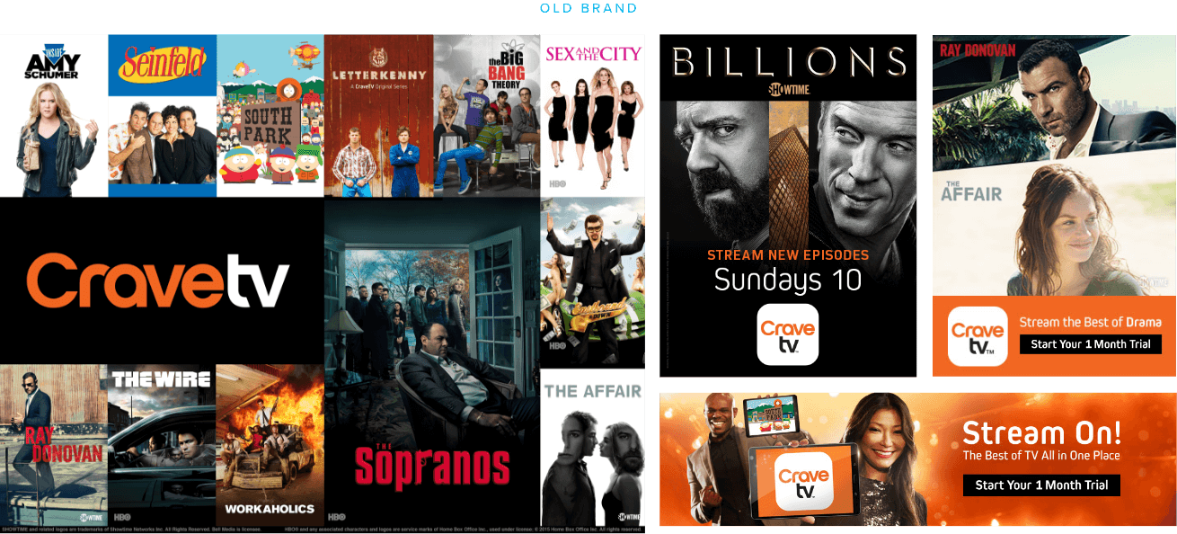
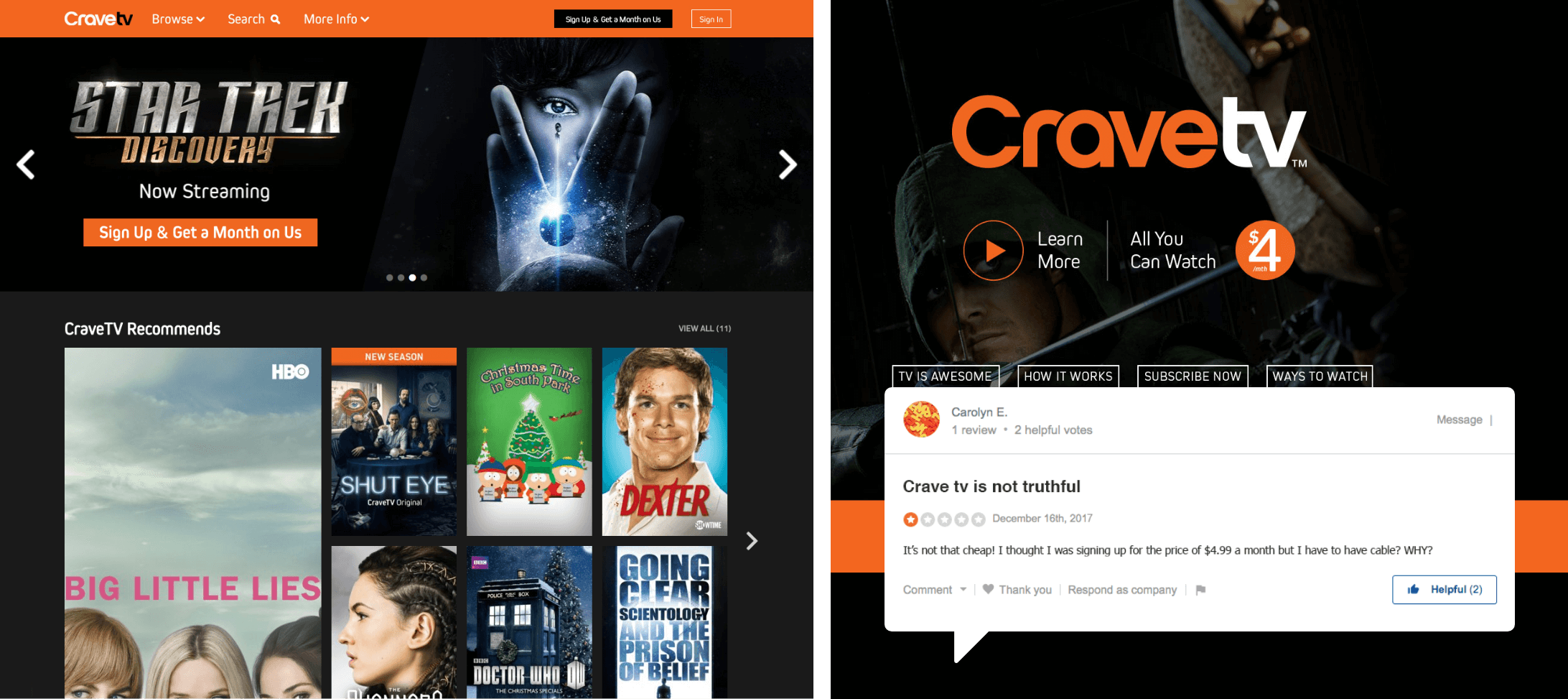
Crave's original value proposition was creating a cheap and affordable streaming platform with the promise of $4/mo price tag for a variety of prestigeous content. Users quickly realized that the deceptively low pricing was tied to a cable subscription which created a poor product image. From the backend perspective, the online platform was also a out-of-the-box solution that was templated and offered a restrictive customization option to offer an intuitive experience. Crave needed to improve its brand equity.
My Role & Goals
UI Designer
Create accessible & intuitive design for IOS, Android & Web
IA & Design Revamp
Increase usability design
16 mo.
Jan 2018 - Apr 2019
+1.5M
New User Subscription
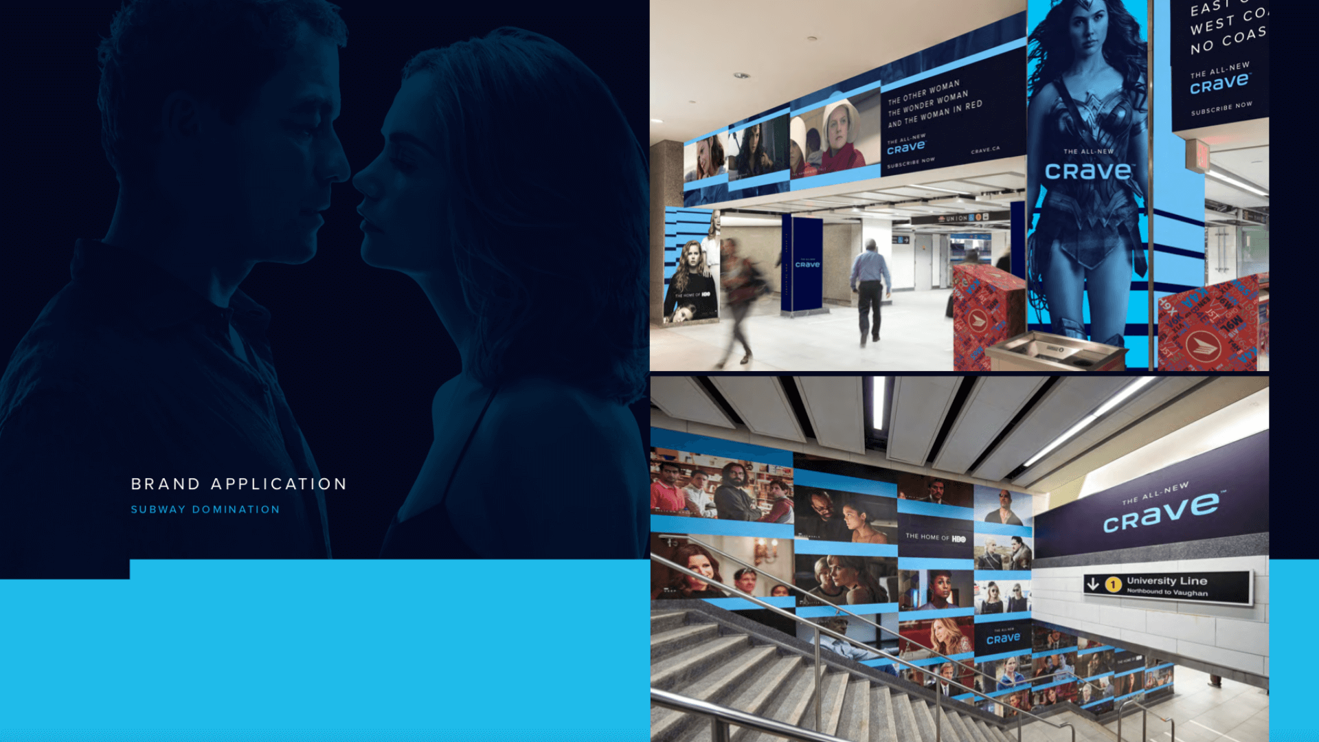
Brand Application
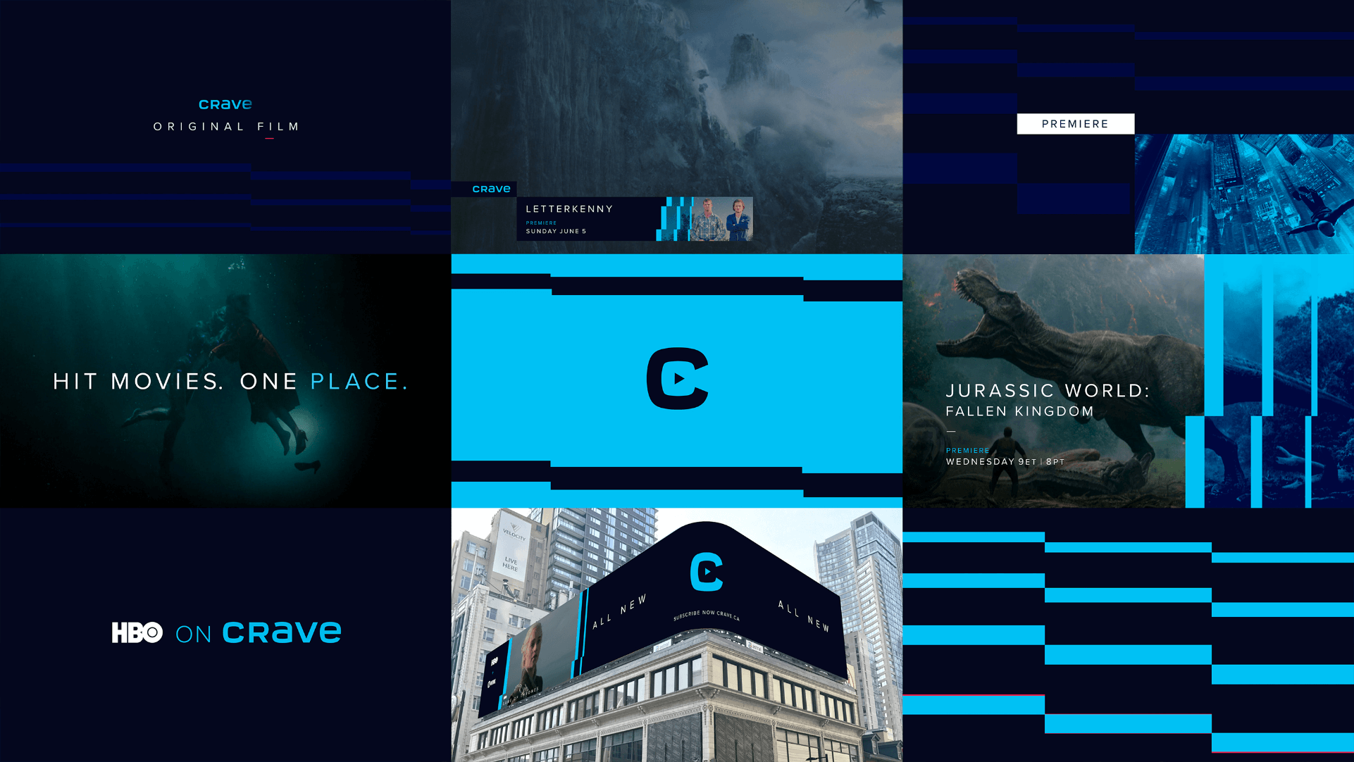
Based on the refreshed brand guide for video, print, and physical spaces, we began to implement a scallable design system for the digital space through typography, color, and visual alignment.
The UI team used the atomic design methodology to create a flexible family of components that worked from mobile, tablet, desktop, to TVos. During the design and development sprints, we also made an extra effort to adhere to ARIA Screen Reader guidelines by including helpful alt-tags, descriptions, read order to enhance accessibility friendliness for all molecules in the design system. This ensured that we built a healthy, inclusive platform for users with special needs.
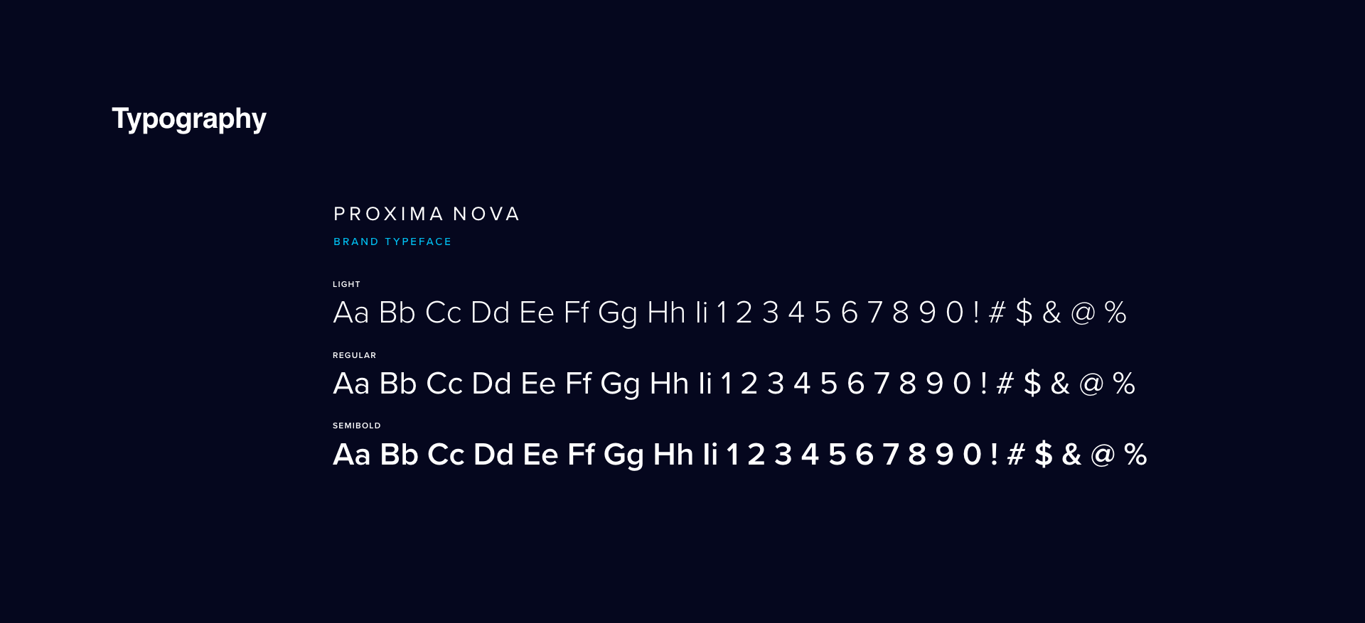
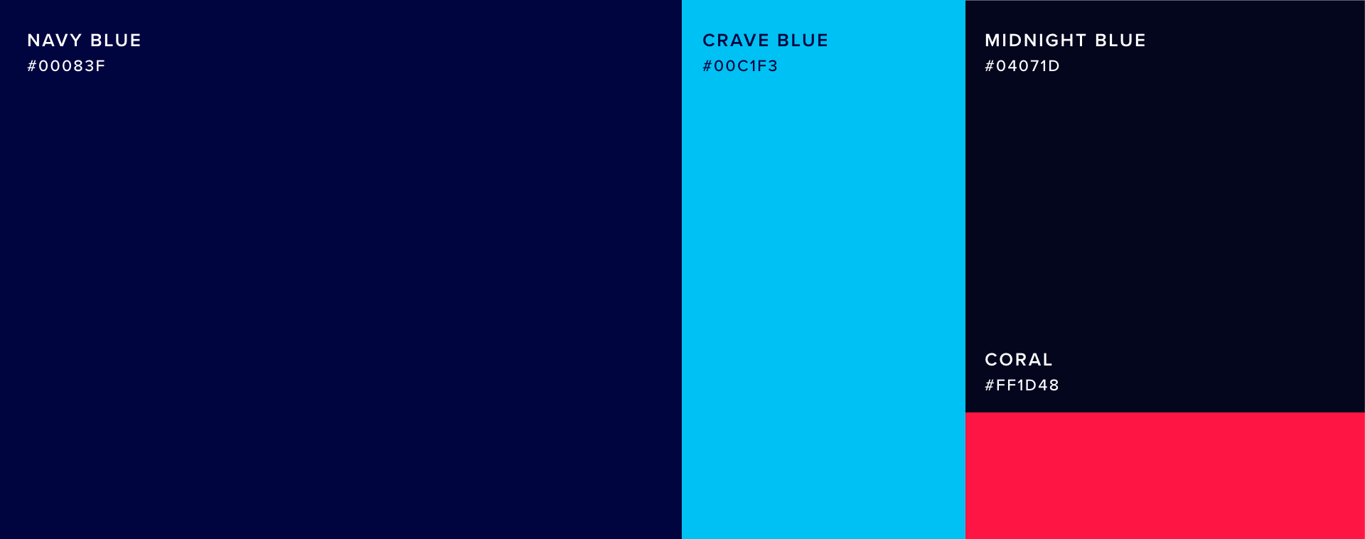
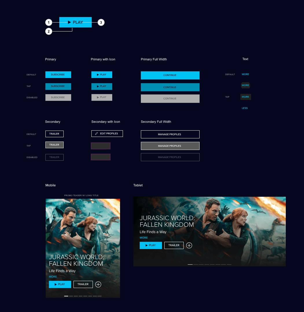
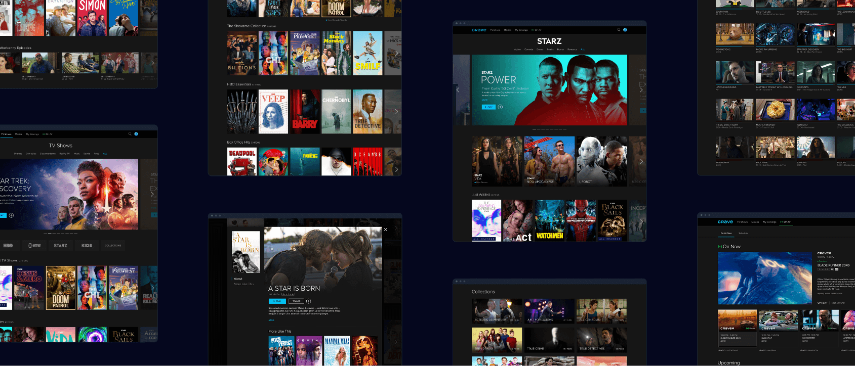
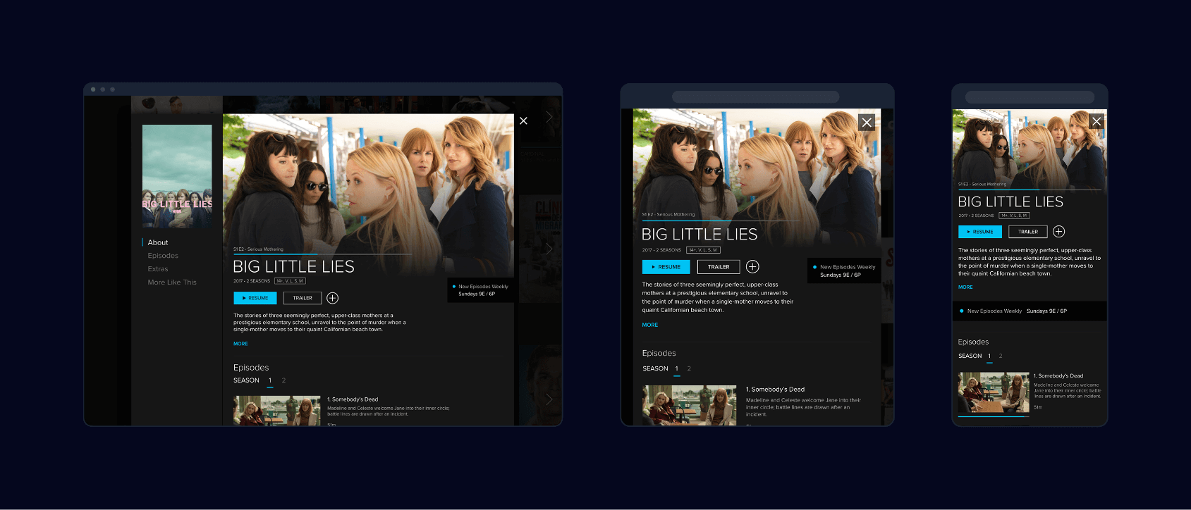
From atomic elements such as color, typography, to primary & secondary buttons to molecules and pages.
Improvements on Interaction
Next, I paid careful consideration to the interaction behavior of the UI components. I introduced smooth easing and transitions to offset any jarring changes between component states. This creates a sense of premium brand quality that was previously in Crave's UI elements.

Poster interaction (above), ARIA labeling (below)
Skeleton page loading animation
Revisit the Standard Video Player
The video player is core to a streaming service. The player in the original Crave product had a myriad of issues such as non-functional logos taking up space, inconvenient layout of icons and buttons, and general visual clutter. Collaborating with UX researchers, I synthesized user feedback from usability studies of 5 participants to address their concerns through the design.
Participants told us they expected to have a similar quality of experience as Netflix. Though the team did not have the same technical feasibility for backend improvements, I was above to address some of the information hierarchy issues on the player.
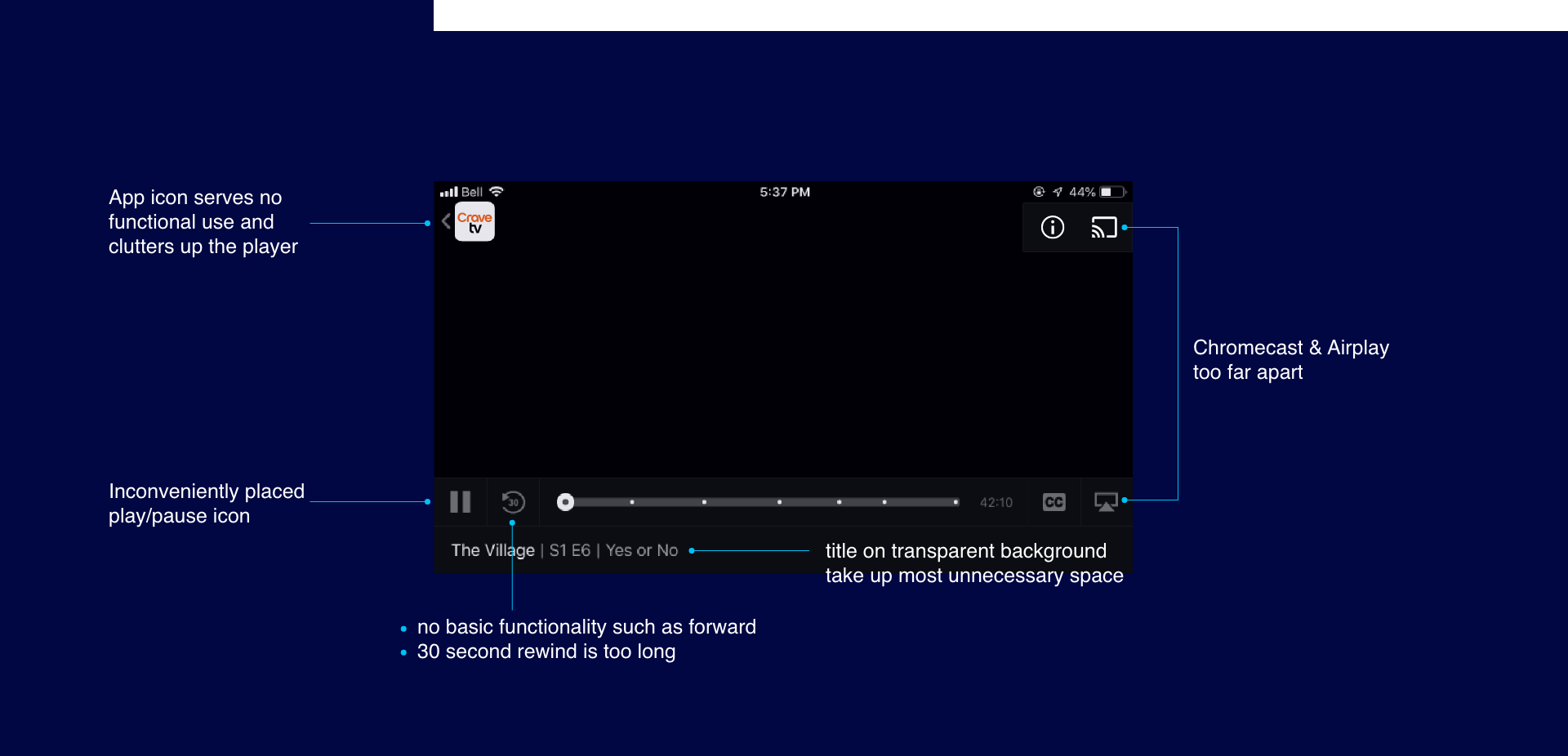

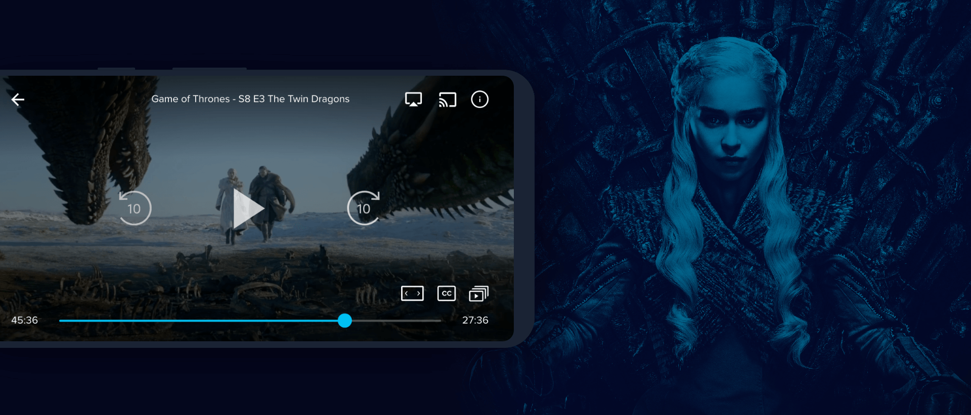
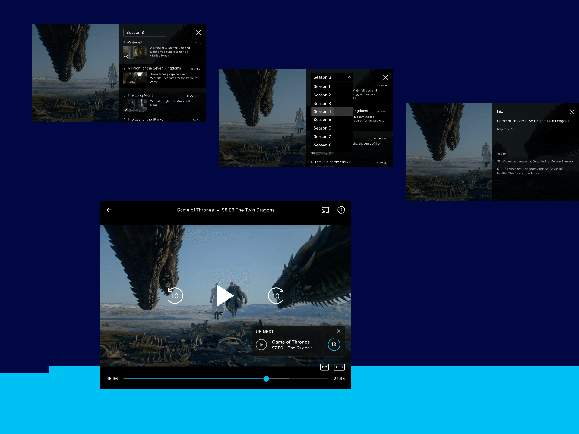
In the new video player, I revisited the icons by creating a stronger visual presence; eliminated clutter of written text on screen; and introduced a info overlay that users could bring up if they wished to view additional information about the show, skip between episodes or seasons. This created a more seamless viewing experience that helped users navigate without leaving the video environment.

Hackathon Win
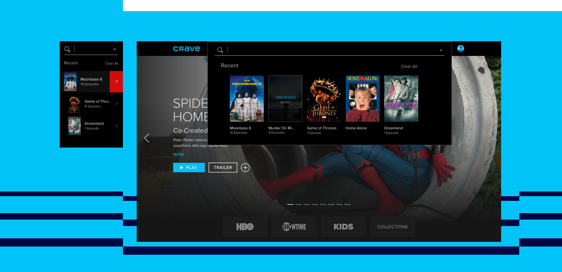
During this project, I also participated in extra challenges like the Hackathon to help generate more ideas to improve the platform. My team thought of recreating the search results dropdown in a helpful way by including recent visits, keyword search history, and the ability to edit and remove search results to start a clean slate for the user. The process took 1 day to design, and 5 days for engineering. We were the final winners of the Hackathon challenge.
Conclusion
The relaunch of Crave took longer than the estimated 1 year revamp. However, the teams across the board paid painstaking attention to ensure product quality was of the highest level. With the help of user research to back up our design decisions throughout the process, we were able to amalgamate HCI methodologies into the product from the beginning. Our results paid off as we surpassed our initial 1M new active subscription benchmark by reaching 1.5M in the first month of relaunch.
